(888) 402-1718

Enric Pastor is a journalist and communicator specializing in design, particularly interiors and architecture. His work consists of researching and analyzing current design -and color- trends and translating them into editorial proposals. According to him, color is not only reflected in the content but also in the way it is represented. We talked with him about his interpretations of color, and how color itself has a direct relationship with natural and artificial light.
What does color represent for you?
Color for me is an emotion. Color is a state of mind, and it’s something very curious because it’s a fascinating subject, and the more I research it and the more I know about it, I realize everything that I don’t know. It’s something so subjective that it’s able to change depending on the shape of the object you observe, depending on the time of day. And above all, I really like to see how it conditions us culturally. Many times we associate certain colors with certain situations or concepts that change according to the culture.
I really like to observe how it changes with natural light conditions. The truth is that a color has a thousand shades and it is not the same color for any person. In fact, there are many times that we perceive the same color in a different way and we associate it with different concepts. I especially like the light at dawn, because I think that when everything takes on a more pastel color, there are not so many contrasts and everything is a little more blurred. I like the coherence that dawn light has.
How important is color during your editorial process?
Color in the editorial process helps a lot. It helps to narrate, it helps to accentuate, to create rhythm and it can even help you camouflage something that is not perfect. I really like the concept that Jasper Morrison coined, when he talked about visual pollution and said that there were certain designs or elements that should not be produced or manufactured in certain colors, because they contributed a lot of noise, a labyrinth to the way of understanding or processing visual images.
As far as editorial is concerned, as I was saying, it helps you create rhythm and associate concepts. For example, if you see a publication made only in black and red ink, you might associate it with the black chronicle or the chronicle of events. Depending on what color you use, it can accentuate and even complete a story or prepare you for a certain atmosphere.
When do you know that a color palette works in a project?
I know that a palette works when the eye is able to go through the whole combination or the whole spectrum of colors you have created and doesn’t get tired of it, when it perceives it in a harmonious way and at first glance there is nothing that stands out. Sometimes, though, I think a perfect palette should also be broken up. It should start with a neutral tone and then you have to put accents in because color creates movement and warm colors tend to move forward, while cool colors move backward. And because of this, it gives you a sense of volume. You can create a lot of rhythm and a lot of movement in a decoration or in an editorial publication through color.
In terms of global decorating, white, earth, beige, pink, gray are the shades that dominate at the moment. Why do you think this very sober palette gets so much attention?
The palette that dominates the world of interior design right now, consists of whites, grays, beige, earth tones and even pink accents. I interpreted it as because we are looking for a sense of wellbeing and a need to withdraw into ourselves. We are looking into the colors of nature, the colors of the human body, the colors of the skin, the colors of the earth, of the mountains. I think it is because of that; to seek a sense of comfort.
Although we are tied to certain palettes, do you think the perception of the use of bolder colors is changing?
I think so. I think that in Spain more and more interior designers, designers, creatives are daring to use other types of colors. Traditionally, Spain is associated with the use of color. We are known for being more daring and braver when it comes to mixing and matching. And I think that is spreading in general to the public, to the people who right now are setting up their homes or choosing specific pieces of furniture. They are more daring with color.
And when it comes to generating content, what is your inspiration?
I think what a journalist has to do is to observe the world very well, to realize what is going on, what people are worried about, what people are talking about. Even something very simple, which is to think about what you would like to tell a friend or what conversation you would like to have the next day on the terrace of a bar. So, starting from there, I believe that the journalist’s job is to transform those currents or trends that you capture in the public, to transform them into content.
What references do you admire for their use of color?
There are many. I think the first reference I would have for color would be Monet, who obsessively painted water lilies and the different moments of daylight. The truth is that I am fascinated by that study. I am also very interested in Mondrian, who imposed himself never to use green in his works because it is not a primary color and in fact, he also had it forbidden in his house, he only used red, yellow and blue.
In cinema there are many references. For example, we were talking about Mondrian, who did not use green, but Hitchcock, on the other hand, was a master of green and especially blue. Almost all his films had that accent. And if we talk about Spain, Almodóvar and his use of red, which can go from blood red to coral. In the end it was this accent that gave meaning to many of his scenes. For example, a woman in Almodovar’s films who always goes by at night, is always dressed in red, which in the end is the point that makes you stand out the most. It’s fantastic how red works.
How do you translate color into your personal life?
I’m fascinated by colors, I really enjoy discovering them and seeing the nuances. But when it comes to my personal life, I would say that I follow a bit of a chromatic diet.
And within this diet, do you have any affinity for a color palette or a specific color at the moment?
For example, I really like gray. In fact, my house is that color. Gray for me is a very neutral color, a little less emotional. Since my house has a lot of light, it is the perfect color to appreciate the nuances. If I had painted it white it would be like having a big hole of light that wouldn’t count for anything. I love gray, but I really like to combine it with strong colors like blue or yellow.
How do editorials deal with color content?
There are many journalistic contents about color, from more practical questions to trying to understand the sensitivity of color or what color can transmit in a certain decoration. We deal with editorials that start with the interpretation of feelings that can be transmitted by color in a decoration. And those contents -which we journalists love-, that try to see which colors are going to be on trend at a given moment.
What color trends do we currently see?
The reality is that we are living in a moment in which we are a little more focused on ourselves and we have looked at the house as a refuge, as a place of wellbeing. So I think the colors that can reflect this moment, apart from the neutrals, are the colors that have to do with the human body and with naturalness. From the pink of the skin, the light browns, the beige, even the very light yellow which is a color like butter, which I think can give a lot of optimism and a lot of well-being in an interior.
Any trends you are more inclined to follow?
I think color trends are more about contrast. I think I’ve always been very attracted to the result of mixing colors like browns, very dark, with tones that have much more light, like sky blue or even orange…
Could you tell us about the concept behind your series ‘Old but modern portals’?
‘Old but modern portals’ is a series I started on Instagram in 2012, in which I document portals or building entrances. Most of them were made between the 1920s and the 1980s, which was a time when architects collaborated very closely with artists. Often it was the architects themselves who created art pieces for these portals, whether they were frescoes, ceramic murals or iron sculptures. And so, in this series, I try to bring all that movement back to the present day, and it can either serve as inspiration for interior design projects or it can simply serve as a reference for those who want to enjoy the pleasure of images in portals that we do not realize. But in the end, it is a heritage that is part of our culture.
And is it the same with color?
Yes, absolutely. In fact, you can do a lot of re-readings of historical projects, extract their colors and bring them back to the present.
Do you think we still have ways to experience color?
I think it’s something that is a bit strange nowadays, but technology is making us change our perception of color. I don’t know if you’ve noticed that sometimes when you go into an electronics store you see the screens and TVs and none of them have the same color even though they are emitting the same thing. I think this is making our perception of color much more complicated and subjective, because we do not all see it the same way, nor do we see it through the same screen or the same technology. However, I think that is a very interesting challenge for the future.
What do you think is the relationship between color and light?
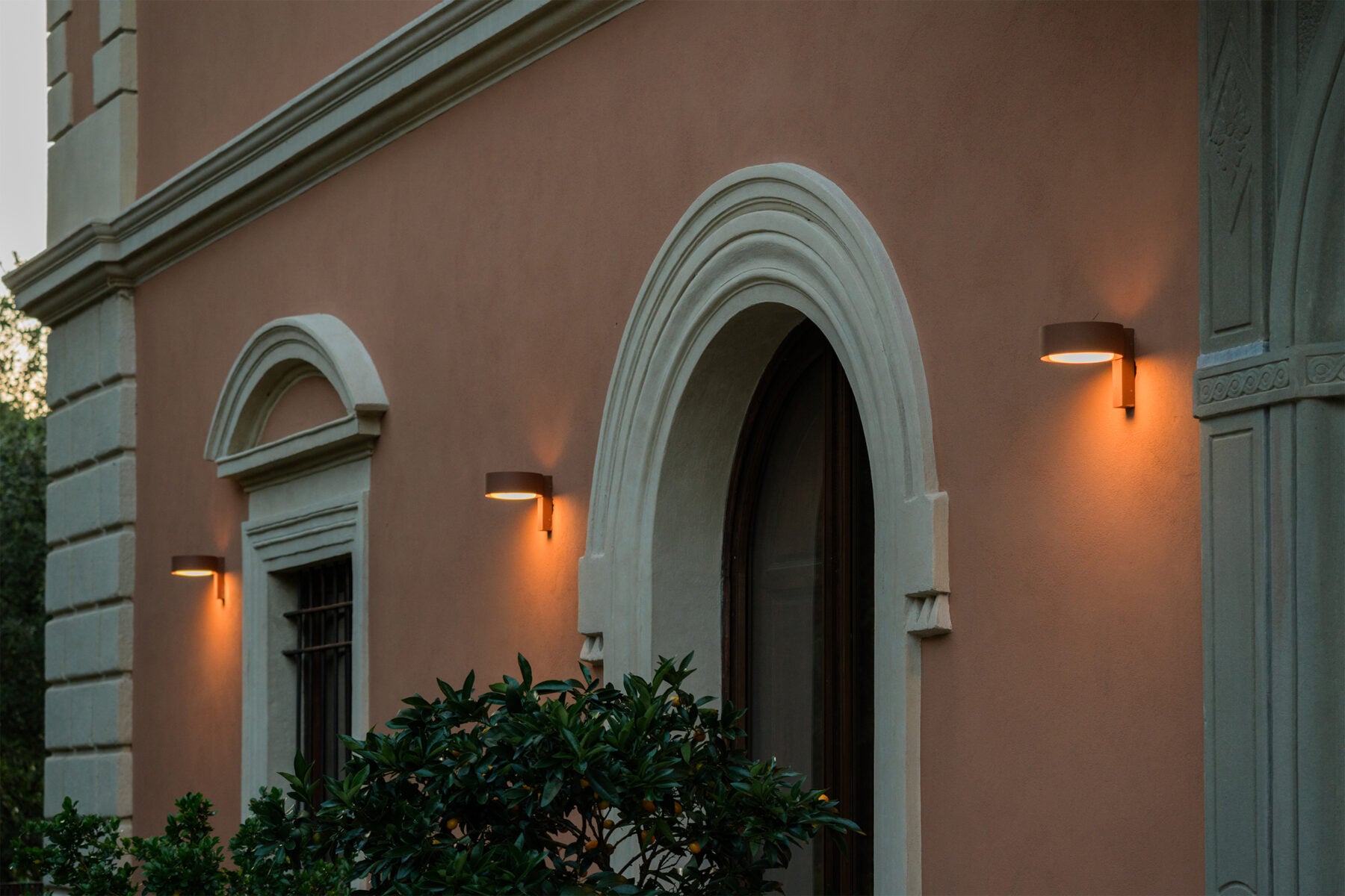
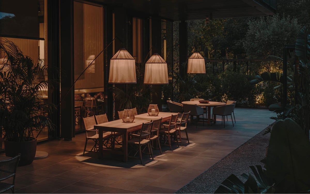
One of the ways in which we are going to learn to experiment with color is with artificial light, the light from lamps. I think it is a challenge in Spain to learn how to light a house. I think you have to be aware both of how that color is perceived with natural light and how it changes later through the lamps or the uses you want to give it. And there, the spectrum is very broad.
If you live in an area with light coming more from the north, you can play with warm and cool lights. You can even learn to integrate artificial lighting and the intensity of a lamp with natural light. You can even play with having the lamps in certain places of the house that help that natural light to be even more intense and better used.