(888) 402-1718
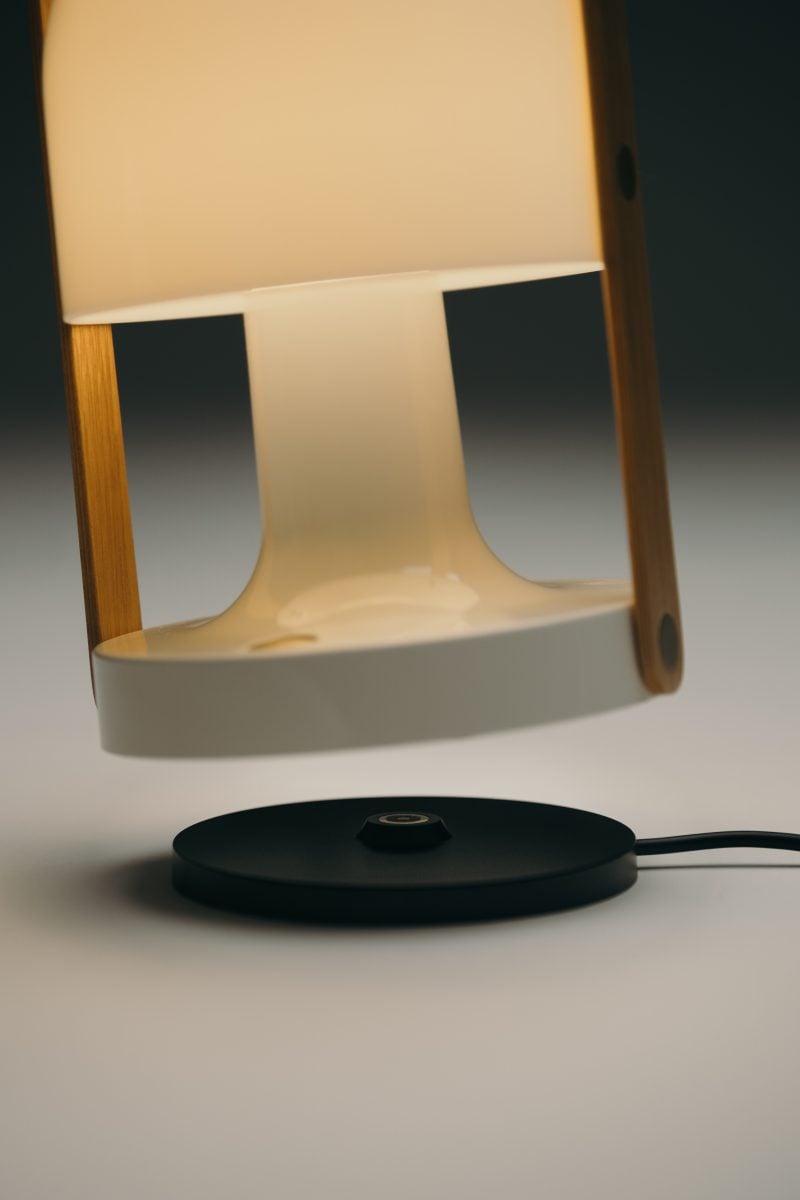
The product designer, Júlia Esqué, through her projects reflects the exhaustive study of her processes and material experimentation. In this way, she also approaches the use of color. In which she works intuitively, hands-on making, from trial and error, understanding the naturalness of the material and the object. She tells us that in addition to being a product designer, she has a multipurpose look that has allowed her to work with projects related to space, accessories and fashion that result in often surprising objects.
Your objects carry a very characteristic style, can you frame it?
I think it’s much easier to talk about how you see someone else, than to talk about yourself or your work. But if I have to say something about myself, I’d like to think that my objects excite and touch the users. And I think there is something constant among them, which is a simplicity – in the good sense of the word – that makes them understandable to the user.
What does color represent for you?
For me, color is a super powerful tool that moves you, where its perception varies according to the person who sees it. Somehow, color makes us connect with memories, with experiences we have lived. Therefore, color is not something flat, but becomes something dynamic, which is constantly changing. We can see it during the day and according to its context, colors change with the light of the day, for example. There is a book by Josefa Albers ‘Interaction of color’, which talks about how two colors that a priori can look very similar, we can make them totally different, just by what we put around them.
Your creative processes are characterized by constant exploration. How important is color during this process?
Yes, just like the formalization of projects, the same thing happens with color, and I have approached it by trying, experimenting and working with my hands. I don’t manage, nor am I interested in working in a systematic way. I use neither chromatic wheels nor theories. I approach it intuitively, through trial and error. From a slightly freer perspective and always related to the object I am working with.
How do you understand color through materials? Do you start with a specific material or color?
There is something important to highlight, and that is that color cannot be separated from the material. Because if we take a color, and we use it on different materials, the result is different. Color is the reflection of light on a surface. So, it depends so much on how this volume is, as well as its finishes (matte, satin or glossy) that makes the light reflect in a certain way, and in the same way it works with the shadows.
How do you think color influences objects, and the person who uses them?
I can’t give you a philosophical view of color, because I don’t know enough, but I’m sure it does influence, because as I mentioned before, there is this connection of colors with memories or emotions. So, there is definitely influence.
What is your criteria behind the choice or use of color?
I think this should not be a decision imposed from the designer, but somehow we should listen to the object and understand what this object asks for. Everything varies according to the context or the relationship in the space where it is going to be. In the same way, it should be taken into account if it has to coexist with the same family of objects or it is a single design.
Who is an important reference for you in your use of color?
I really like to look at fashion and haute couture. I perceive it as a super free discipline, without prejudices and I find in it references from different designers that work very well for me. I am also very interested in the work of Bertjan Pot, a Dutch designer who works with colors in a very particular way. And then there is a graphic designer’s studio. His name is Ryan Carl Studio and he uses serial prints to talk about a theme, working around the interaction between texture and color. So, you go through the different images and you see the concept behind it very clearly.
Do you have an affinity for a particular color treatment or a particular color?
On a personal level, I’m interested in colors that are powerful, powerful, strong, not necessarily saturated, but the colors that you can see contain other colors inside. And beyond that, I know which colors don’t interest me as much. In English there’s this word called doll, which means “dull, dull or sad.” A red, for example, that’s dull or pastels don’t interest me as much as vibrant colors.
In your latest collaboration with Paloma Wool, both the material and the color stand out. How do you experiment with these elements?
The Paloma Wool project was super interesting, it started when I was prototyping some rugs and I needed to make a model to understand how the weft and warp -which are the vertical and horizontal ones- would work, and I didn’t have a loom available. So, I started making some mock-ups with paper and cardboard to understand how it would work and how different colors and shades could be applied. When I did, I saw that it had potential but I was limited because the colors I could use were the ones I could find on cardboard or paper. As a result, I decided to forget about the rugs for a bit and started this project for Paloma Wool where I would create some color palettes digitally, print them out and from there I worked on them analogically, making the traumatized ones.
How did living in New York influence your work and your style?
New York is a tough city, it’s not very easy, it’s gigantic. Labor-wise there is a lot of competition and a lot of pressure. I arrived one winter and the same thing happened to me as when I went to live in Lausanne to study for my master’s degree, I arrived and people told me “you’ve arrived and it hasn’t been that cold for 30 years”. So, as much as the working conditions, as much as the cold, I felt I was struggling against all odds. But on the other hand, I learned a lot. I think I had a very good teacher. However, when you come back you realize how good life is in Barcelona.
Do you think the context influences how we perceive color?
I think it does. It has a direct relationship with perception and how we connect these colors with previous memories and experiences. There is a story that I have never found out if it is real or not. They say that the Inuit can see more than 80 shades of white, and can differentiate between the white color of snow, a bear or clouds. And because they are used to seeing so many shades of white from a young age, they have names for each of them.
What do you think is the difference and importance between exhibiting your projects and people making direct use of them?
I make objects for people to use. So, when that happens, I’m happy.