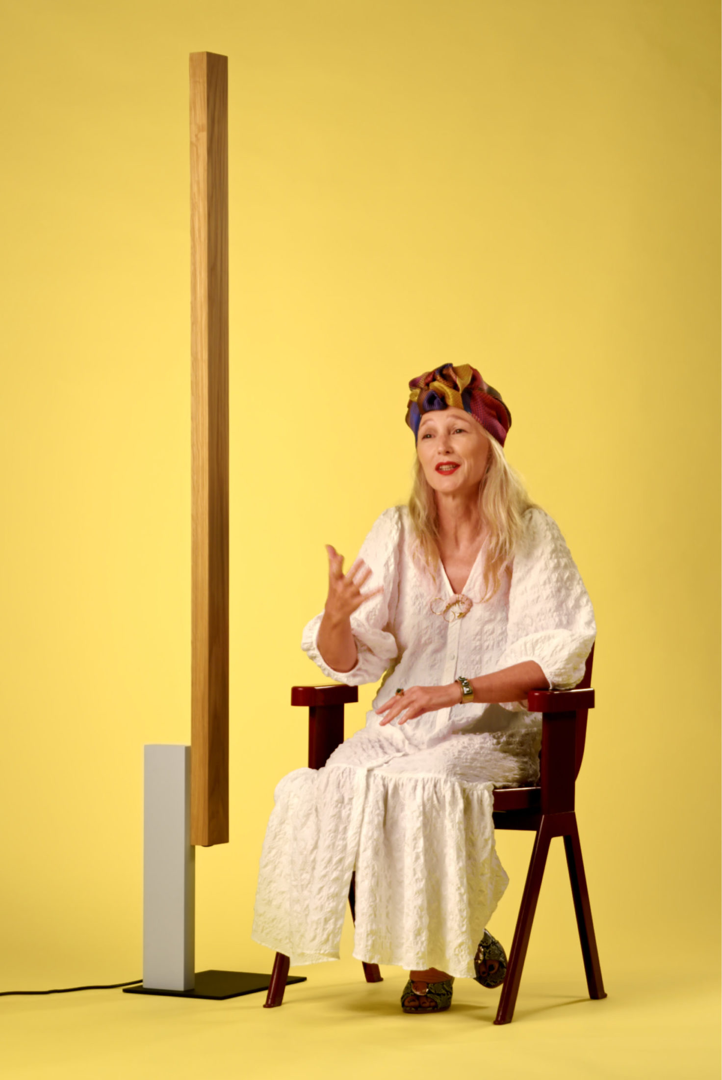
Gudy Herder is a trend forecaster and founder of Eclectic Trends, specializing in interior design and lifestyle. Through her work, she observes trends and turns them into something meaningful and applicable. Color has always been an integral part of her work, translating through color what society lives or needs. Gudy is recognized as an expert in color and, today, talks to us about her vision of color.
What does color mean to you?Well, color is omnipresent in our work. We are all day surrounded by color because our work is very visual and because we always study the meaning of color and the effect color has on people. So, from the morning until the evening, whenever we work color is always there. It's a big part of all of our work.
How does color affect people's lives?It affects us a lot. And the interesting thing is that people are starting to be more aware of the meaning of color, and so they use color in specific terms, especially the professionals, interior designers, designers in general, and color specialists are bringing color to the people in a way that they understand that color has a true meaning and an effect in their everyday lives. So I think that is a big evolution. Color is not only nice to have, something to make our life pretty or comfortable, but people start understanding that if I work with that specific color, then the meaning is this and that influences my lifestyle in a specific way. So there's definitely an evolution.
What is your criteria when choosing a color palette?Well, when we study trends, what we do is we first research how society is feeling right now. Especially at this very moment, we have a big shift in consumer behavior because our values and needs have changed. And that's where we start. We start with observing and looking into a lot of market research about how we feel right now. And then we see how these new values and needs can be translated into design. And then color comes into play because obviously this goes hand in hand. But what is interesting here is that color comes sometimes at the end of this chain because people believe very often color is the very first thing that is like the kick off. And we believe, yeah, that can happen. But very often we start looking into how we feel, where is society right now? And then we see how we translate that in a certain color palette.
How did your passion for trend reports start?My passion for trends was not planned. I used to work for one of the biggest retailers here in Spain. They have 70 retail stores by the name of Kibuc and I did all the styling and the catalog and I was responsible for the accessories. So I went from trade show to trade show, trying to buy accessories for all the stores here in Spain. And when I would come back from the trade shows, I always came back with a report like ‘this is what is coming, this is what I'm seeing, this is happening now in terms of materials and shapes and color’. But there came a point when I said there must be more to it. It's not just colors or materials. Why are people so drawn to a specific color palette? Why are we craving tactility? etc. And then you start researching and you find answers. And this is when all the trend reports as we do them now came up, which is very much based on where is society at now.
How do you start working and researching color reports?We work with multinationals, basically with corporate organizations, and what we do is we deliver a general trend report or a Tailor-Made trend report, which is very specifically crafted towards that brand. And we always work in the same industry, which is interior design and lifestyle. And depending on the briefing, we deliver what a trend would be in the upcoming 48 months, we add a color palette and we can even make suggestions for future collections. It depends on what the client is looking for.
Why does a trend report cover a two years term?I believe that a trend report can easily cover a two years term. The truth is that many, many brands need to bring out novelties and new connections every single year. Although right now many are just line extensions because they feel it's not a moment to do a brand new collection, but maybe adding further colors or adding further shapes to an existing collection. But I believe two years is fine right now because there's not that much rotation on the market. Everything has become a little slower because we are not in the fashion industry. When it comes to Interior design. Yes, you can. When it comes to accessories, you can accessorize every year or twice a year. But like solid furniture or the solid structure of your home, you don't change it that often.
Do you think the perception of color has changed, with the current situation?Yes, we are looking forward to slowing down in general and we like to be a little bit more sustainable. So there is not a big turn around right now. One exception is, since our life has become so hybrid right now, we are working from home. We will go on working from home. And that means there's a lot of changes within our homes. We are slowing down, but we need to adapt our home, our new lifestyle, to what is going on now. Therefore, we have started seeing a demand for different color palettes right now. So on one side there's a wellbeing color palette with neutral tones. We even see a soft violet right now, which corresponds to the theme of escapism because we were longing for an escape. And we have experienced a virtual escape during the past year. And we saw a lot of Instagram, a lot of sunsets and a lot of surreal landscapes from 3-D artists. And on the other side, I see a palette of blue hues because blue stands for innovation and technology and technology has totally exploded. Experts say that the advance of technology we have seen in the past 15 months would have corresponded to 10 years. Blue is the color of technology and innovation, and at the same time, blue gives clarity. That's something that we all need right now. So there are the two things, like the wellbeing color palette on one side and then I see a whole universe of blues coming up rather strong.
Do colors have a season?Yes, colors definitely have seasons, especially in the fashion industry, and we are somehow related to the fashion industry. But as I said before, I like to think more in terms of color palettes because they last longer. I don't see that we need to change that often in the interior design industry. Not like spring, summer, autumn and winter. I believe that we need to cherish color a little while longer than changing that every six months.
What color trend do you think never goes out of style?If a color never goes out of style, then we would call it a timeless color. And there is specifically one color that comes to my mind, which is the universe of pink. I very often see that it's still said “oh, pink is trending or this type of pink is trending”. But I believe that pink has become two things: It has become timeless. It's not a trending color anymore, it's everywhere. And it has become genderless. So it's more universal than ever. Pink for me is already a color that never goes out of style. It's totally timeless.
Do you think color trends are coming back? If so, which ones?Yes, they do, because, as I said, color is tied to emotions and we have, for instance, this thing of cocooning. We've seen this word, this term cocooning. We've been seeing it for a while now. And now cocooning is coming back, but with a new sense, because cocooning was always something that we would do in our home. We would cocoon, we would have layers of textures, and we would like to have our time slow down. Now cocooning is expanding towards the public space because we felt so safe in our homes for the past month. My home was my safe harbor and I want to have that feeling when I leave my home. So public spaces will have all this cocooning thing right now and it will look much more homely, much more comfortable, like waiting rooms, airports, hospitals. All this is changing already. It's a color palette that we had inside our homes, a very soft color palette that we've been bringing outside now.
What inspires you to choose a color palette in your creative process?Always the feeling and the meaning that is behind it. What does this do to me? How does it make me feel? That is my major inspiration.
You have talked about color psychology before. Can you tell us about it?Well, there is always a positive and a less positive sense. A color that stands alone can have a meaning. But when it is paired with other colors, then we could have a new story. We would really need to look now into color psychology, color by color, so I can give you a major understanding. But the idea is that color is a messenger. Color is not an add on, it's not nice to have on my wall, but that color on the wall is helping me to feel a specific way. So anybody who is interested in choosing the right color should look a little bit more into color psychology. And you don't need to be a pro. You don't need to be an expert. It's on the Internet, and it's in books. It's everywhere.
Do you have an affinity towards a specific color or chromatic palette at the moment?No, and you know why, because I'm surrounded by color all the time. It's like when someone asks me, what trend do you have at your home and I always say: zero. Because I knew that I would need to change my furniture all the time, my wallpaper and my colors. I mean, I do from time to time. We moved into a new home shortly before the pandemic. And it was very colorful in my home and I just thought I needed a change. So right now it's rather monochromatic. I know that at a certain point I will add color again, but it goes with everybody. Like we have our we have our season. So right now I'm not having a specific favorite color.
Does anyone inspire you by their treatment or use of color? Yes, two people. On one side there is this Brazilian art director. His name is Michell Lott, he's a color specialist.. He is amazing. I haven't seen anything similar in my life. He uses color in a very bold way and at the same time, he's very harmonious. But he is all about color. He uses a lot of color. He's very interesting to follow and and even to contact and to get inspired. And then on the other side, there is an American artist, James Turrell. He works light, space and color in a way that it's all an entity. And I was lucky enough to visit one of his installations, which is in Japan on one of the islands and be immersed inside this color, light, space. And it's just mesmerizing what this does with you. So these two these two creatives and artists are basically a reference.
Do you think it is possible to keep innovating through color?Yes, one hundred percent, because many people think innovation is technology. Whereas innovation is adding something new, a new idea, a new concept. And you can see amazing projects where color is the main driver and in a totally unexpected way, in a way that people would never think that is possible. So this is innovation for me. You don't need to have the latest technology or in an immersive experience to say this is an innovation. Color can be a very powerful driver if it's used in a totally unexpected way.
